Posts: 19
Threads: 3
Joined: Mar 2004
I like the fact that I have some measure of control over my interface screen, so I've been toying around with it a bit. I wish that I had even more exact pixel-by-pixel control over things, but maybe that's just my perfectionism nature peeking through after years of using CAD and image editting software.
To be quite honest, I really haven't changed much. That can either be attributed to GW's already-slick interface, my lack of imagination, or the fact that I got used to the default interface and I'd have a hard time drastically altering things now.
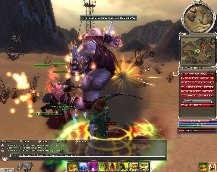
Anyhow, here's what I did. I run GW @ 1024x768, but I scaled this image down to 800x600 and compressed it.
![[Image: gw0076we.jpg]](http://img260.echo.cx/img260/7717/gw0076we.jpg)
As you can see, I left almost everything as-is. I moved the experience bar to the lower right because it looked kinda middle-of-nowhere. This leaves me with a great big chunk of upper-left screen to watch my battle. I like to see how my exp is progressing, but I don't need it covering up important action stuff.
I enlarged the health and energy bars and stacked them. They were too small for me. I'm considering making them even larger.
I've made other minor changes that aren't readily apparent in this screenshot, but they are mostly just very small positioning adjustments.
What kind of whacky interface modifications have you guys come up with? Like I said before, I lack imagination to make any grand changes, but I am a shameless plagarist and will greedily copy any interface alteration that strikes me as awesome.
Heh, considering that this is the RBD crowd I half-expect someone to say ":aar: I turned off everything except the health and energy bars! :aar:"
Posts: 3,040
Threads: 49
Joined: Mar 2004
My interface has gone through some pretty significant changes.
- I made the compass a bit smaller, though I left it in the upper right corner.
- Underneath the compass is my minimap (U) which I find quite useful to let me know where I have already been -- and thus where no mobs are likely to pop out of the ground at me. I shrunk it down to be about the same size as the compass.
- Next down is the party list, which for me is a bit longer than what yours is showing since I have a pet.
- Under that I have my health, mana, and XP bars.
- Next is the target selection, target skill bar, upkeep window (for monks), and enchantments box.
Along the bottom, I have my skill bar, the trade button, and my weapons tabs. Just above the skill bar is my chat window, which I have made wide but not very tall. I often have the chat window open while adventuring. In short, all the map functions are in the top right, the combat functions are mainly in the lower right, and chat is along the bottom. This leaves the majority of the screen -- everything but a strip along the right and another along the bottom -- free for viewing and character navigation. It also keeps the combat functions nicely clustered so it's easier to tell what's going on at a glance instead of having my eyes roam all over the screen.
Posts: 573
Threads: 40
Joined: Mar 2004
Zed-F Wrote:My interface has gone through some pretty significant changes.
- I made the compass a bit smaller, though I left it in the upper right corner.
- Underneath the compass is my minimap (U) which I find quite useful to let me know where I have already been -- and thus where no mobs are likely to pop out of the ground at me. I shrunk it down to be about the same size as the compass.
- Next down is the party list, which for me is a bit longer than what yours is showing since I have a pet.
- Under that I have my health, mana, and XP bars.
- Next is the target selection, target skill bar, upkeep window (for monks), and enchantments box.
Along the bottom, I have my skill bar, the trade button, and my weapons tabs. Just above the skill bar is my chat window, which I have made wide but not very tall. I often have the chat window open while adventuring. In short, all the map functions are in the top right, the combat functions are mainly in the lower right, and chat is along the bottom. This leaves the majority of the screen -- everything but a strip along the right and another along the bottom -- free for viewing and character navigation. It also keeps the combat functions nicely clustered so it's easier to tell what's going on at a glance instead of having my eyes roam all over the screen.
Hey Zed,
Could you post a screenie of your arrangement? I'd like to see it, as I think I don't know what some of the items you mention are (e.g., the minimap - I didn't know there was one that you could have persist on your screen!). Like DeeBye, I haven't done much customizing at all, other than moving the experience bar down to sit on top of the life and energy bars, but you've got me thinking that maybe I should!
Cheers,
Hawkmoon
Posts: 3,040
Threads: 49
Joined: Mar 2004
The minimap can be toggled by hitting the 'U' key. It defaults to be fairly large but like any other interface component can be resized. If you leave it big you can use it for long-distance navigation (getting from A to B) but it tends to clutter the screen; I use the main map (M) for that instead. The other uses of the minimap are knowing where you've been and getting a view of what you've mapped and will thus show up properly on the main map, and for both of those a small minimap the size of the compass works nicely. The minimap is persistent as long as you are in the same zone but if you change zones you will need to toggle it back on again. I'll try and post a screen later.
As for the other items, you can just go in to the edit interface function (under customize in the menu button) to see what things there are to move around. The only other one that could be confusing is the upkeep bar, but only if you haven't played a monk yet.
Posts: 3,040
Threads: 49
Joined: Mar 2004
Here's a screen shot so you can see how I have it set up. I shrunk it a bit, but you still ought to be able to see the general layout. I tried to get stuff going in as many interface elements as possible, but this char is no monk so there's no upkeep for instance.

June 5th, 2005, 12:52
(This post was last modified: June 13th, 2005, 23:25 by soul.)
Posts: 119
Threads: 6
Joined: Nov 2004
Haven't changed much of my setup, moved the compass to the bottom where I was used to it, dropped the experience bar on top of the health and mana bars and shrunk it a bit.
![[Image: interface.jpg]](http://www.realmsbeyond.net/sf/interface.jpg)
Edit: Revisied my interface to how I have it now. The screenshot isn't set up perfectly, but its a bit better looking than what it used to be, now allows me to view the battlefield (despite still hardly ever looking up at it) and and enough room to avoid alot of misclicks and see the bars moving.
![[Image: interfacemonk.jpg]](http://www.realmsbeyond.net/sf/interfacemonk.jpg)
Posts: 127
Threads: 0
Joined: May 2005
![[Image: gwui29ta.th.jpg]](http://img288.echo.cx/img288/8484/gwui29ta.th.jpg)
My chat window is usually minimized and the upkeep bar is to the left of my weapon switch, otherwise this is how I usually play.
Posts: 19
Threads: 3
Joined: Mar 2004
Green_Gloom Wrote:![[Image: gwui29ta.th.jpg]](http://img288.echo.cx/img288/8484/gwui29ta.th.jpg)
My chat window is usually minimized and the upkeep bar is to the left of my weapon switch, otherwise this is how I usually play.
I like your setup, but doesn't tucking your health and energy bars way upper right make tham a bit hard to track?
Posts: 127
Threads: 0
Joined: May 2005
DeeBye Wrote:I like your setup, but doesn't tucking your health and energy bars way upper right make tham a bit hard to track? Not any harder than placing them anywhere else near the border IMO. I'm mainly using it because it resembles my CoH UI and I have gotten used to that. If you're used to having the bars elsewhere then it will be harder to track of course.
Posts: 219
Threads: 26
Joined: Aug 2005
The only three changes I've made to my interface has been to drop the expbar to above the HP/EP bar and stretch it out so its length is equal to both bars below; and then I nudged both the chat window and the upkeep panel up a notch so they don't overlap.
|
![[Image: gw0076we.jpg]](http://img260.echo.cx/img260/7717/gw0076we.jpg)
![[Image: gw0076we.jpg]](http://img260.echo.cx/img260/7717/gw0076we.jpg)
![[Image: deebyesub.gif]](http://s88432259.onlinehome.us/lounge/deebyesub.gif)


![[Image: interface.jpg]](http://www.realmsbeyond.net/sf/interface.jpg)
![[Image: interfacemonk.jpg]](http://www.realmsbeyond.net/sf/interfacemonk.jpg)
![[Image: gwui29ta.th.jpg]](http://img288.echo.cx/img288/8484/gwui29ta.th.jpg)